Language nomad
My capstone project at Thinkful. Language Nomad is a new kind of language learning app where users have interactive activities to learn real world conversations.
_edited.png)
Project Overview
The Problem
Language learners want to learn real world conversations such as ordering food and drinks, purchasing items in a store, and communicating with taxi drivers.
Pain Points
-
Language learners are not learning real day to day conversation
-
Language learners struggle with listening, speaking, and grammar skills when studying
The Solutions
-
Design a new kind of language app that allows users to learn actual day to day conversations.
-
Employ research backed education tactics to ensure users learn quickly and in a way they enjoy.
Role
UX, UI Designer
Task
Design an app that allows users to learn day to day conversations in different languages
Tools
Figma, Adobe Express, Canva, Google Forms, Miro Whiteboard
Audience
Adults 18 - 44 interested in learning a new language
Discovery and Research
To begin, I conducted competitive analyses of three competitors: Duolingo, Rosetta Stone, and Memrise.
Duolingo would certainly be the biggest competitor. With a large social media following and thousands of reviews on the app store, Duolingo is unlike any other app on the market. However, Language Nomad would be far more interactive as it would allow users real world language education.

Rosetta Stone is a very close second competitor after Duolingo. Rosetta Stone has been around for over 30 years and is one of the most well known language learning programs on the market. Rosetta Stone uses research backed methods to help users learn their chosen language. When designing Language Nomad, I employed similar techniques in my research. My design contains several factors such as word games and flashcards that are proven to help people learn words and phrases.

Memrise, while not as widely known by the respondents of my survey, is one of the top 150 learning apps currently on the app store. So what sets this app apart from others? It offers over 20 languages but offers no incentives to its users. I believe that by combining incentives along with some factors from other apps I have researched, Language Nomad would soon find its way to the top 150 learning apps on the app store.

Next, I created a survey on Google Forms. This was a 19 question survey that was shared on several different Slack channels and received 43 responses.
This survey gained information about people's history of learning a new language, their device usage, and what material they find most important when learning a new language. The results of this survey heavily influenced the design of this app.
_edited.jpg)
Of all 43 respondents, 95.3% said they have tried to learn a new language in the past, with only one respondent saying they have not. Immediately, this tells me that a vast majority of adults have tried, or are trying, to learn a new language and, due to today's high usage of device usage, most of these people would be interested in an app designed to assist them in their learning.
_edited.jpg)
Following that first question, respondents went on to share what language they would most like to learn, what type of material they find most important when learning a language, and their pain points when studying a new language.
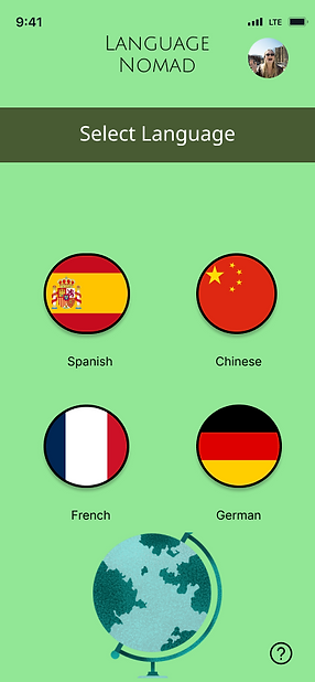
The top four languages chosen on this survey were French, Spanish, Chinese, and German. When learning a new language, people want to learn how to purchase items from a store, order food and drinks from local restaurants, communicate with taxi and bus drivers, and be able to have a conversation with a stranger in their native language.
_edited.jpg)
Why is all of this important? Knowing people's reasons and motivations to learn a new language influenced the type of material I included in my design. Knowing what people actually want will help to keep out unimportant information in this app. Language Nomad is, after all, designed for people that want to learn substantial conversational material in a new language.
Once I gathered my survey responses and analyzed the data, I moved on to user interviews and created user personas.
_edited.jpg)
_edited.jpg)
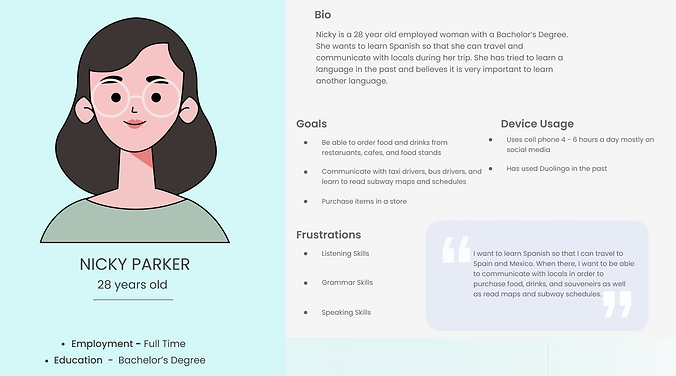
Nicky is a 28 year old woman that wants to learn Spanish in order to travel to Spanish speaking countries. While traveling, she wants to be able to order food and drinks, communicate with bus drivers or read subway maps, and purchase items in stores. Her frustrations when learning Spanish are listening skills, grammar skills, and speaking skills.
Knowing potential users pain points was extremely important when designing this app. This allowed me to ensure that there were activities and lessons that combat these frustrations. Therefore, in my design, there are lessons that enhance users listening and speaking skills in whichever language they are studying.
Throughout all of this research, I employed the double diamond approach. I conducted research and interviews as the discover phase followed by creating user stories and flows for the define stage. Then, I developed my MVP and created more detailed stories as part of the develop phase. Finally, in the deliver phase, I conducted more interviews and watched as participants navigated my design.
Information Architecture
After finishing user interviews and creating user personas, I developed three different user stories. These stories are:
1. As a language learner, I want to use an app that allows me to easily learn another language, such as Spanish, in order have conversations with people in their native language.
2. As a language learner, I want to use this new language learning app to study French terms and sentences in an easy way.
3. As a language learner, I want to use this new language learning app to be able to order food and drinks from restaurants when I visit other countries, such as China.
These stories were important for me when developing my MVP. My MVP was to have at least 4 languages, activities and lessons, and a user profile. Having these stories to guide me through the process of achieving my MVP ensured that I did not stray from the original purpose of this app - to allow users to learn real world conversations that will help them in their travels, work, or schooling.
My next step in this process was to create user flows, shown below.

As you can see, the user flow shown above follows the user from the very beginning of choosing a language to study, in this case French, and continues through them selecting their lesson, 'Getting Around Town', and finally, working on that lesson. I completed several user flows but each one follows a similar route. The importance of these user flows was to help guide me through the process of designing this app. I needed to ensure that the flow of the app was logical before diving into Figma and designing.
Brand Development
Before working in Figma, I moved to other sites such as Canva and Pinterest to help inspire my design. Below, you will find my initial mood board, creating on Canva.
Prototyping
_edited.jpg)
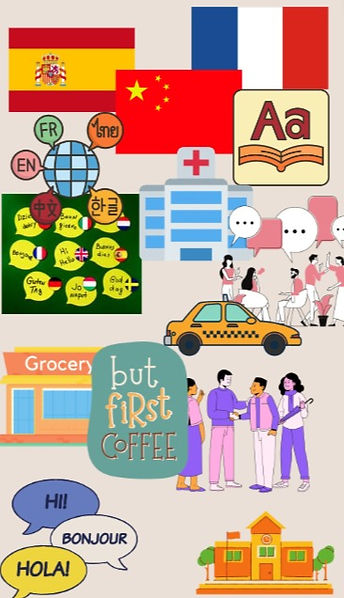
I already knew, from my research, the languages that would be included in my design and wanted to showcase flags for those countries. Therefore, I included several images of flags for different countries on my mood board.
I also knew that I wanted to include lessons on speaking with strangers, communicating with taxi or bus drivers, purchasing items in stores, and ordering food and drinks. All of these are showcased here though various images found on Canva.
At this point in the process, I was not sure of the exact color palate that I wanted to use but I knew I wanted there to be a green element reminiscent of a chalkboard. Therefore, I included an image of "Hello" in several different languages on a dark green chalkboard colored background.
Next, I went on to develop the logo for Language Nomad. My immediate thought was to have a globe of some sort as it pairs nicely with the name Language Nomad. To begin, I sat down with a marker and some paper and did some sketching, shown below.


In the end, I decided to go with a more traditional globe design. Already knowing my color palette would include greens, I found that these colors would compliment the other colors well. You can see from my final design and from my color palette image below, that these colors create a cohesiveness across the app that allows for easy navigation.


Finally, I created my style guide. I continued with the green theme as I had originally planned.
My buttons were created in Figma and Adobe Express.
The hard part was choosing the typography. I went through numerous types to find the perfect combination. In the end, I went with Julius Sans One and Khmer. I felt these complimented each other well and went with the theme of education.
After completing my research, user interviews and stories, and planning of the app design, I moved into the prototyping phase. To begin, I started with some sketching. The image below is of my Crazy 8's sketch.
_edited.jpg)
After taking some time to sketch, it was time to start working on low-fidelity wireframes and prototypes. Below is my wireframe for this project.
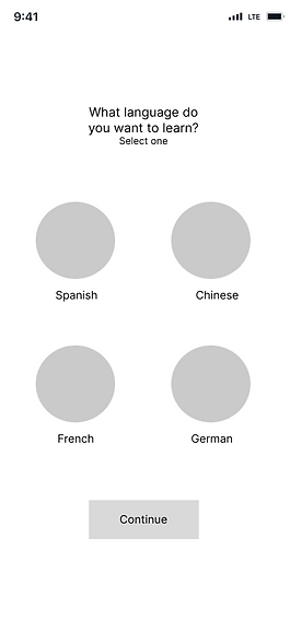
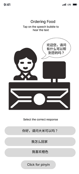


As you can see from these wireframes, I did not stray too far from my original sketching ideas. These frames show, in order, the language selection screen, a lesson selection, the home page, the pages for ordering food in Chinese in characters followed by Pinyin, and finally the profile page.
After receiving some feedback for my wireframe, I moved onto creating my high fidelity prototype. I went through several iterations of this design to find the perfect balance of color, size, type, and hierarchy. Below you will see a few images of my early designs.


I conducted some early testing and received some feedback about my design. I felt as if something was off about the design and getting the early feedback concerning the color let me know my instinct was correct. I went back to Figma and edited my design a few more times before I achieved my final design.
After editing and re-editing my design some more, I finally conducted official usability tests. I had four participants all of whom followed a series of tasks after answering questions regarding their history of learning languages, device usage, and what they believe to be most important when learning a new language.

As you can see, all four participants in my usability testing were able to follow all scenarios and complete the tasks on the first try. The only exception being Ms. Jones being unable to get to the home page on her first try. She commented that there should be a distinct 'home' button on the page instead of being asked to click the name at the top of the page to go home. As you will see in my final design, I decided not to take that advice for a couple reasons. One, when a user first downloads this app, they will be given a tutorial on how to navigate the app. This will show them how to get to the home page. Second, when I tried to add additional buttons in my design, I found it getting messy and even harder to navigate. As I wanted to keep this design uncluttered and modern, I decided not to include a distinct home button.


Language Nomad went through many changes during the time I spent working on it. Looking back to my MVP (four languages, lessons and word games, and a profile), I achieved it at every stage of this design.
Thanks to the respondents of my survey and the participants in my usability testing and interviews, I was able to design an app that gives users what they want - activities and lessons that allow them to learn language in ways that they can actually use when they visit these countries for work, school, or leisure.
If this app were to be fully developed and go live, there are several more options I would include in this design. First, more languages such as Korean and Arabic would be offered. I included German, French, Chinese, and Spanish as those were the top four chosen in my initial survey but adding more widely spoken languages would open this app to more users. Additionally, in order to set this app even further apart from competitors and to allow a more interactive design, an option to speak in real time between users would be offered. This feature would connect users in real time with others that are studying the same language. They would have the option to text or voice chat with each other in order to practice their listening and speaking skills in real time. These features would not only set Language Nomad apart from competitors but would allow users to have an even greater ability to truly learn these languages in real world scenarios.
Final Thoughts
After all the research, interviews, and designing, I presented this project as my final Capstone project for my Thinkful certification. Six months prior to this project, I would never have believed that I would be at this level of design. This project allowed me to hone in my design and research skills in order to create a design that has been accepted as all those that have viewed it as a wonderful design that could change the world of language learning.
Throughout this whole process, I learned more in Figma as well as gained better time management skills as I set most of the deadlines for this project on my own. Overall, I have created a design I am proud of and happy to share as my capstone project.
Some images for my final prototype were found online. Attribution for those images are: <a href="https://www.freepik.com/free-vector/chinese-restaurant-interior-empty-cafe-traditional-asian-style-with-red-gold-decor-lanterns-sakura-pictures-cashier-desk-cafeteria-with-wooden-tables-chairs-cartoon-illustration_10798279.htm#query=chinese%20restaurant%20interior&position=8&from_view=search&track=ais">Image by upklyak</a> on Freepik and
https://iconscout.com/illustration/cute-girl-5071079
Thank you!