My City Bus
My first project at Thinkful. A bus app designed for a Midwestern city to help users get to where they need to be, when they need to be there.

Project Overview
The Problem
Public city transit users need more accurate information about their busses. The users want to view multiple bus lines at once and know when their bus will arrive to the station.
Pain Points
-
Bus riders miss their busses frequently
-
Changes in bus routes are not updated
-
Bus riders do not know the exact time their bus will arrive
The Solutions
-
Design an app that gives more accurate time and tracking information on busses
-
Allow users to quickly access information regarding regularly used bus lines
Role
UX, UI Designer
Task
Design an app that allows users to receive more accurate information about their bus
Tools
Figma, Adobe Express
Audience
City bus riders in a Midwest, urban area
Discovery and Research
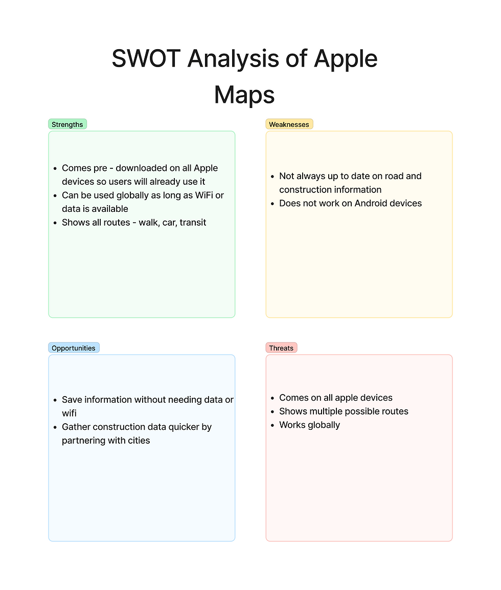
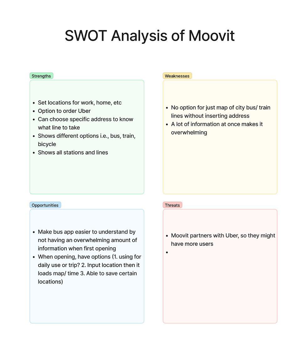
I employed the double diamond technique when researching for this project at every stage. To begin, I conducted competitive analyses of two potential competitors: Moovit and Apple Maps.
I chose these two apps because they are two of the most popular transit apps available in the US. Apple Maps is available on all Apple devices and Moovit is a popular choice in the app store. These two apps are well known and some of the biggest competitors of My City Bus.
Click on the arrows to move between competitive analyses.
Next, I created a survey via Google Forms to gather more information regarding people's use of public transit. I gained respondents from my network of friends and family, Slack, and SurveySwap.com.
This was a 20 question survey that gathered information pertaining to people's use, or lack thereof, of public transit, their current perception of public transit, and their demographics including age and the type of area they lived.

25 people responded to my survey. Of the respondents, 52% never use public transit despite 48% of them living in an urban area. From this, I was able to gather that most people, even when offered to them, do not use public transit.
_edited.jpg)
_edited.jpg)
After gathering all of my survey responses, I moved on to User Interviews. Taking the information I learned from my survey and my interviews, I created a User Persona, Joshua G. Joshua G. is a 25 year old male that lives in a suburban area but works in an urban area. For his job, he travels around the urban area delivering various items to different locations. He does not use the public transit because his deliveries are time sensitive and drives to ensure all goals are met.
The suburban area in which he lives does not offer public transit options to get to the downtown urban setting in which he works. Though he does have to drive to work every day, if a public transit option were offered, he would be more than willing to use it as his job gives him a company vehicle to use while at work.
_edited.jpg)
Information Architecture
Before beginning my design phase, I was given three user stories to use. They were:
1. As a bus rider, I want to know when my bus is arriving at the Washington & State bus stop, so I can calculate how much time I have to reach the bus stop.
2. As a bus rider, I want to know the next bus arriving at the Washington & State bus stop, so that I don't rush to the bus stop if it is not my bus.
3. As a bus rider, I want the ability to view future arrival times for any of the seven bus lines (Serving Washington & State), so that I know when my bus arrives.
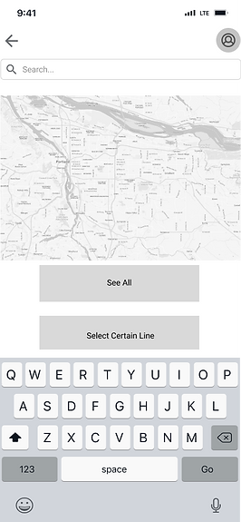
Taking what I have already learned from my research and the information from these user stories, I created a user flow for my app. This user flow (shown below) begins at the Home Page and shows the steps needed to get to the live map and future schedule of Washington & State. The live map would show all the buses currently in route while the future schedule will show the times buses will arrive to that stop in the future so the user can plan their time accordingly.
_edited.jpg)
After my research, user interviews, and user flows were completed, it was time to begin working on the design on the app. The first thing I did in this phase was to create a site map. As you can see in the site map below, it follows a similar route as my user flow. From the home page, users will have 4 options: choose destination, personal information, see live map, and plan a trip. From see live map, users may see the future schedule and from plan a trip, users may choose their destination and time in order to see future schedules.
_edited.jpg)
Brand Development
Prototyping
Following my research, I began developing the brand identity of My City Bus. I conducted research of my own to find inspiration for my design and put together an inspirational mood board on Figma, which you can see below.

I knew from the beginning that I wanted a minimalist and modern design. At first, I was unsure of what color palette I wanted to use for the design but I knew I wanted various buttons, screens, and maps. The image of busses on the lower right corner was my first inspiration for a logo.

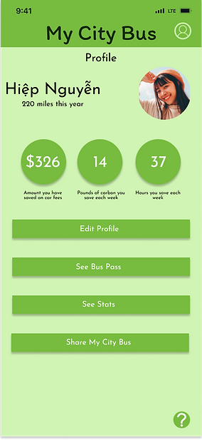
Here is the style guide for My City Bus. I decided on a green color palette because it compliments the idea of a "green" footprint, which I also include elements of on the profile page of my final prototype.
I chose this typography combination because I believe it gives the design a more laid back feel. While I wanted this design to be more modern, I did not want it to be a harsh angular design, therefore, I chose Itim and Josefin Sans as the fonts for this design.
Finally, I developed the logo for My City Bus. I knew from the beginning it needed to include a bus. I researched other logos from transportation companies and finally turned to Adobe Express to create my logo, shown here.
.png)
My next step was to begin sketching ideas for the design of the app. I had several ideas in mind and knew there were a few factors I needed to include such as seeing a live map, planning future trips and seeing future bus schedules, and having a favorites option for quick access to commonly travelled locations.

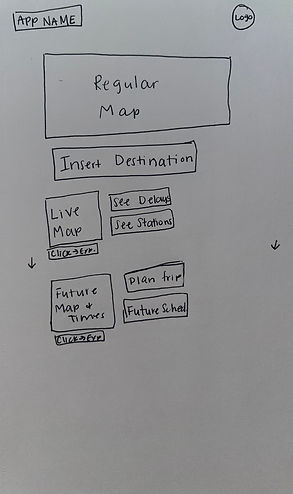
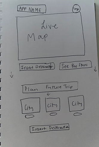
After taking some time to sketch, it was time to start working on low-fidelity wireframes and prototypes.


After creating the low- fidelity wireframes and prototype, I went on to conduct a usability test. It was important that potential users would be able to know how to find their bus route and schedule and easily navigate the app. Once I completed the usability test, I went back to Figma to edit and do some redesigning.
After I created my high fidelity prototype, I conducted usability tests. I tested two people and asked them to find their way through my app in scenarios such as how to find directions to their destination, how to see the future bus schedule, and how to add something to their favorites. I then asked them their opinions on the design of the app to which they responded some things, like knowing which map they were viewing, was confusing.
You can see the prototype I used below. The type face on the pages such as Home, Directions, and Insert Destination was a bit difficult to read. Along with that, there was no real way to know what map you were viewing on the Home Page.
.png)


During usability testing, I asked my participants a series of questions including age, career, location, and their usage of buses. I then had them go through a few tasks, which you can see on the report below.
Taking those notes into consideration, I edited my prototype and was finally left with my final product, which can be seen below.


My final iteration of My City Bus changed drastically when comparing it to my sketches and low - fidelity wireframes. Due to my usability tests, I knew I needed to make the layout easier to understand. I did that by starting with the home page. The user now has the choice to view a live map or a regular map, instead of being shown both upon opening the app.
When looking back at the user stories, I have met all the needs of the users. When using this app, you can see all the bus lines serving Washington & State, know the time the next bus will be arriving, and plan a trip using the future bus schedule in order to more accurately plan their day. Thus, the MVP was met.
After meeting the MVP, I wanted to include a few more details that would set this app apart from competitors. The biggest addition is the profile page. Not only can the user customize the app, they are also shown information regarding their carbon footprint and money saved by using the bus. Looking back at my research, most people that do not use the bus have a car. By showing users how much money and time they are saving and how much they are helping the environment, they may be more keen to using public transportation.
Final Thoughts
After all the research, interviews, and designing, I presented this project as required by the Thinkful curriculum. Creating and designing an app from scratch is not something I would have ever imagined I would do but, in the end, I can say I am proud of my hard work and am looking forward to future projects.
As with any work, this project was not without its mistakes and learning curves. The most important thing I learned during this was how to properly use Figma. With the help of my Thinkful mentor, I went from a complete novice in Figma to being able to troubleshoot problems on my own. During this time, I realized I was forgetting something extremely important while creating wireframes - grids. After what felt like hours of trying to get everything lined up perfectly, I remembered I had forgotten to set them. After applying the grids, my design ended up polished and ready for presentation.